
Bland by Design: Marketing’s War on Personality

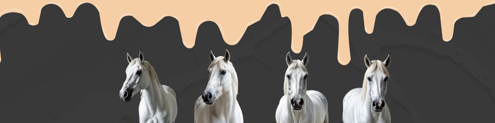
Open Instagram and tap the explore tab. Whether the algorithm believes you’re a stay-at-home sourdough hobbyist or a Wallstreet finance bro, everyone gets the same creamy splash of oat-milk lattes and oat-milk cardigans against oat-milk walls.
Close the app, walk outside, and the street keeps scrolling. The coffee bar on your corner, the co-working space in Lisbon, the boutique hotel lobby in Seoul; the vibe is “calm,” “elevated,” and “100 percent rentable on Airbnb.” It’s also as boring as drywall paste.
What began as a niche minimalism once promoted by Scandinavian bloggers has metastasized into a planetary monoculture. The look is instantly recognizable: matte neutrals, brushed brass fixtures, a fiddle-leaf fig, a statement of “clean” type on the wall if any type appears at all. The feeling is equally predictable: safe, marketable, frictionless. If modernism once promised to make the world new, contemporary minimalism promises only that the world will be smooth. The texture of global life has become … untextured.
That shift is not unintentional. Behind every brushstroke of beige lies a latticework of production decisions, investment incentives, digital feedback loops and, increasingly, machine-generated templates. The result is a feedback spiral in which culture trains the algorithms that decide what culture looks like tomorrow, a spiral now accelerated by gen AI.
Where the Whimsy Went: How Historical Cycles Flattened into a Single Line
Design history has never been linear, yet it has always been dynamic. Decades pass, pendulums swing. Psychedelic poster art yields to 1970s earth-tones, which yield to Memphis pastels, which yield to Calvin Klein prim, which yields to Y2K’s neon websites, rhinestone logos and clashing prints. Crucially, each swing derived energy from reacting against its predecessor. Difference was the engine.

iMacs in the early 2000s
But the twenty-first-century design cycle hit an inflection point the moment taste became both global and instantaneous. Social media collapsed the distance between niches. A corner café in Auckland no longer had to inspire only its neighborhood; it had to photograph on a four-inch screen for an audience halfway around the planet. The safe solution was to erase eccentricity. Beige, greige and sage promised to offend no one and travel everywhere.
Unlike earlier shifts, this one has not yet birthed a true countermovement. Maximalism resurfaces on runways and TikTok every few months, but as soon as it threatens to gain traction, the algorithms course-correct. Loud patterns are labeled “too busy” by machine vision built to prefer low-noise images. Content that deviates from the median is quietly buried. Cultural volatility has been replaced by a thin, persistent hum.
The four horses of the Blandpoclaypse
Global commerce: Multinational brands favor styles that offend no one. Neutral sells in Tokyo and Toledo alike.
Algorithms: Social media platforms reward images that trigger quick likes; clean, well-lit neutrals outperform noisy eccentricity.
Digital constraints: On a phone screen, flat icons and high-contrast sans-serifs load faster and read clearer than ornate graphics.
Generational aspiration: For debt-burdened Millennials and Gen Z, uncluttered spaces signal control, wellness and even status.
The Economics of Risk Aversion
Behind the color wheel lurks the spreadsheet. Venture-backed restaurants, e-commerce startups, hotel chains and direct-to-consumer brands share the same imperative: scale fast, scale everywhere. Investors reward repeatable concepts, not one-off quirks. Beige walls are cheaper to repaint across hundreds of locations than bespoke murals. Neutral logos adapt more easily to merchandise, packaging and app icons. The visual identity of a brand is optimized for asset libraries and pitch decks long before it meets an audience.
Retail landlords further encourage the smoothing. A landlord rolling out identical “white-box” retail spaces expects tenants to bring in furnishings that won’t clash with future tenants. Real-estate brokers photograph listings the same way, stagers replace eccentric paint with agreeable earth-tones. Taste, in effect, becomes collateral—something to standardize so that mortgages and leases can be securitized without the complication of personal style.
Consumers then mirror what they see. When every aspirational condo listing showcases a waterfall-edge quartz island and beige Venetian plaster, the next buyer asks for the same. Risk aversion trickles down into personal life decisions until eccentricity appears fiscally irresponsible.
Algorithmic Curation and the Cult of the Clean Feed
If economics sets the stage, algorithms cue the scene changes. Platforms measure success by engagement: likes, dwell time, shares—their ranking systems reward images that are legible at thumbnail scale, consistent in tonal value and free from distracting variation. A saturated floral wallpaper may thrill in person, but compressed to a phone screen it reads as chaotic noise.
Photographers learn the lesson quickly: dial down the saturation, lift the whites and crush the blacks. Influencers study which posts spike follower numbers and replicate those exact settings. An aesthetic born of photographic convenience metastasizes into an aesthetic norm. Before long, real spaces are renovated to look like the photographs that looked like idealized versions of spaces. Reality warps to fit its own representation.
As machine-vision models power more of the ranking decisions, the process accelerates. Machine learning identifies the statistical average of “good design,” then pushes more creators to mimic it in order to maximize reach. Deviant patterns are not banned, merely throttled. Homogeneity is not enforced from above; it is coaxed from below by the invisible carrot of visibility.
The Great Logo Convergence
Nowhere is sameness more explicit than in corporate identity. Colorful wordmarks, illustrative mascots and quirky ligatures have been stripped for parts as companies rush toward flat, geometric sans-serifs. The trend began around 2013, when mobile interfaces demanded that logos stand up to high-resolution icons. Twelve years later, the geometric sans-serif has become the oxygen of branding and visual identity often starts with a plug-in: type in a name, pick from five AI-generated palettes, press export. The result is not an identity but a statistical probability.
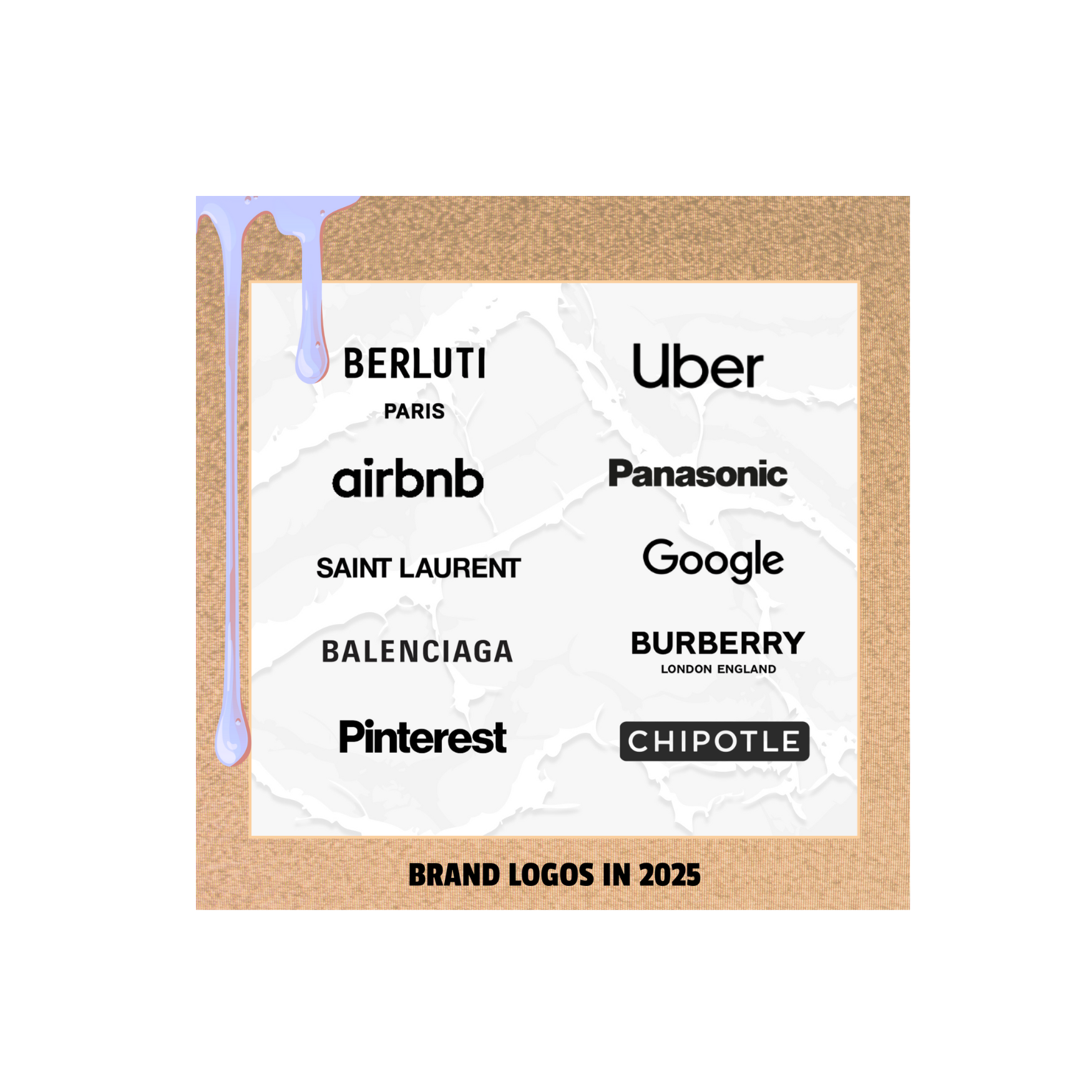
This is not to say that homogenization isn’t practical. Thin strokes scale across devices, reduce printing costs and sync with UI font stacks. Yet the loss is palpable: identity dissolves into interchangeability. A consumer encountering one brand’s billboard has already half-forgotten the last billboard because both speak in an identical voice. And when every mark speaks the same language, the only remaining differentiator is marketing spend, not meaning.
Generative AI and the Cult of the Median
Homogeneity would have marched forward under human guidance alone, but gen AI has added jet fuel to the process. Trained on billions of images scraped from the public web (images that are themselves the product of algorithmic curation) AI produces what the internet already looks like, only more so. It synthesizes the average of averages and serves it as novelty.
Consider the rise of AI design assistants. Need a brand identity? Enter three adjectives: “modern,” “clean,” “accessible” and within seconds the model returns a suite of logos in grayscale with a bold pop of color. (Tough time to be a new media company taking inspo from a bee colony, amIright?) The client picks one, validates the style with market research and inadvertently feeds more of the same material back into the training pool. Circulation without deviation is the system’s animating principle.
Even illustration and packaging have succumbed to a default style: softly rounded shapes, flat shading, muted candy colors. The look is not strictly Nordic or Silicon-Valley; it is AI-Valley, emergent from statistical smoothing. AI image generators produce these visuals not because they are trendy but because they are mathematically central. The mid-century modern chair, the wabi-sabi ceramic bowl, the eucalyptus sprig—they persist because they cluster densely in the training data.
Design is not the sole casualty. Copy platforms promise to generate “on-brand” prose for landing pages, emails and social captions. Trained on millions of marketing lines, the models return an easy-to-skimming cadence: short sentences, emotional verbs a call to action. The same pattern surfaces in thousands of brand voices.
When every e-commerce description reads like every other description, language stops differentiating and starts pooling in a single semantic puddle. Small brands that once competed on voice now compete on ad-spend because voice is no longer scarce. A feedback loop emerges: because distinctiveness is rare, paid targeting becomes the only lever, reinforcing the algorithms that created the problem in the first place.
Music portals are next. AI composers generate royalty-free soundscapes for retail stores, YouTube intros and meditation apps. Each track claims to be unique, but the chord progressions, timbres and BPMs drift toward an agreeable mean. Culture becomes a playlist without refrain. And if you want to be really creeped out, take a look at our recent story on The Velvet Sundown, also known as the AI generated band that fooled the world.
Imagining an Anti-Neutral Future
In the end, beige is only powerful because it is easy. It lowers risk by flattening difference. Re-texturing the world will require discomfort: longer design cycles, higher upfront costs and interfaces that occasionally surprise or even irritate.
But the alternative is a future so polished it slips from our grip, a planet rendered in agreeable neutrality where nothing meaningful can take root. Culture thrives on friction; without it, we are scrolling an infinite feed of our own shrinking imagination.
Cultural theorist Fredric Jameson once called postmodernism “the cultural logic of late capitalism,” dominated by pastiche and recycling. If beige minimalism is the latest logic of our algorithmic age, perhaps the next chapter will, by necessity, be its opposite: vivid, local, unpredictable.
The remedy here, however, is not to swing back to chaos for chaos’s sake but to re-establish friction as a necessary nutrient. Surprise, mismatched form, stubborn hue—they remind us that we live in a world composed of innumerable contexts, each worthy of its own visual voice. The real frontier lies not in more seamless automation but in intentional rupture; to carve pockets where curiosity pools and let color seep back into public life.
Until we privilege those ruptures, the café on the corner and its copy thousands of miles away will remain indistinguishable postcards from the Beige Empire—pleasant, efficient and silently depleting the imaginative commons. So remember, your next brushstroke, logo tweak or copy prompt can either deepen the beige or break the spell. It’s up to you to decide if you’re bold enough to color outside the lines.